Monday, February 23, 2015
CSS Positioning
The CSS Box Model:
http://www.w3schools.com/css/css_boxmodel.asp
The position declaration:
http://css-tricks.com/absolute-relative-fixed-positioining-how-do-they-differ/
Positioning elements with CSS:
http://www.barelyfitz.com/screencast/html-training/css/positioning/
And here's a link to a tutorial that steps you through page creation from scratch, using Dreamwever - download the sample files, and we'll be stepping through the first four parts of the tutorial:
https://helpx.adobe.com/dreamweaver/how-to/first-website-part1.html
Thursday, February 19, 2015
#inspo site
THE RUMPUS (literary heterogeneity ushered by images)
1. clean header / nav bar
2. attractive banner image / logo
3. blog style layout for seamless browsing
4. poetry and literature w/out gimmicks
5. shop literary paraphernalia
"Write Like A Motherfucker."
1. clean header / nav bar
2. attractive banner image / logo
3. blog style layout for seamless browsing
4. poetry and literature w/out gimmicks
5. shop literary paraphernalia
"Write Like A Motherfucker."
Wednesday, February 18, 2015
Aspirational site
http://www.charliewaite.com
1.Basic layout, logos, font
2. Basic gallery layout
3. Dynamic Nav-Bar
4. Blog with page
5. Social networking inline with homepage
1.Basic layout, logos, font
2. Basic gallery layout
3. Dynamic Nav-Bar
4. Blog with page
5. Social networking inline with homepage
Natalie's Blog O' Choice
Le Happy
- Simplistic edgy design
- Blog content as well as a shop
- Utilizes social media to gain following
- Photography vs. article ratio
Justine's Aspirational Blog
Art Therapy
1. Basic sans-serif font
2. Hover over Titles to read more
3. Use of pictures
4. Side bar (popular)
5. Nav bar
1. Basic sans-serif font
2. Hover over Titles to read more
3. Use of pictures
4. Side bar (popular)
5. Nav bar
John's Aspirational Blog
Ball of Spray
1. Use of the entire page
2. It's a blog that anyone can post articles to
3. Good use of pictures, videos, and interviews
4. Search Bar is easy to navigate
5. Good fonts and style of header and logo
1. Use of the entire page
2. It's a blog that anyone can post articles to
3. Good use of pictures, videos, and interviews
4. Search Bar is easy to navigate
5. Good fonts and style of header and logo
Aspirational Site
Arctic Wild
1. Simplistic Navigation bar overlaid on background image.
2. Visually striking home page with interactive map.
3. Transparent logos.
4. Simple color schemes that are consistent over all pages.
5. Square article previews.
1. Simplistic Navigation bar overlaid on background image.
2. Visually striking home page with interactive map.
3. Transparent logos.
4. Simple color schemes that are consistent over all pages.
5. Square article previews.
alison's aspirational site
Parrot Design Studio
1. nav bar under header
2. search bar
3. sans serif font
4. professional photography
5. ecommerce
6. "shop" is separate from custom work
Tuesday, February 17, 2015
For Wednesday, 2/18
Hi all. I totally blew it for the homework posting – I thought I'd posted links for the "Net Neutrality" project, but I just left it as a draft. My bad. If you've already done work on it based on my verbal review of the material, great, you're ahead of the game – but I'm going to push back the due date, so I can provide a few more helpful links, and give you more time to do proper research. I'll post some links at the tail of this post.
WHAT'S ACTUALLY DUE FOR WEDNESDAY:
The other thing I requested was that you were prepared to do a short 5-10 minute presentation on an "aspirational" website that's in the same genre as the website you'd like to create (this could be the same one you wireframed), and speaks to five design elements that you think are effective, which you would like to keep in mind for your own site (alternately, if you think the site does something poorly, talk about how that element could be improved). This will give you a list of five design choices to guide you in your initial choices for building out your own site, so you don't have to start with a completely blank page in front of you. Please be ready Wednesday with a site to present, and on this blog, make a post where you link to the site and list out the five design elements.
On Wednesday, you'll also finish up your website header/homepage draft.
FOR MONDAY, FEB. 23
This will be the new deadline for a three-page paper, either in defense of, or in opposition to, Net Neutrality. On the 23rd, we'll take some class time for you to share your research with other students on your "team," and we'll have a class debate on the topic. With all of these issues of technology and government, the devil is in the details, and I would like you to get into the particulars in your research. It's not enough to make the case for Net Neutrality – you should also argue why classifying the Internet as a public utility is a good way of protecting Net Neutrality.
On the anti-Net Neutrality side, it would be good to articulate a case for having "fast lanes" on the internet, and how that could potentially make for a better internet overall – but you can also focus on an argument of why classifying the internet as a public utility is not the right method to keep a "free and open" internet.
These links are not comprehensive -please Google further - but they at least give a place to start:
Overview links (everyone should read these):
A summary of the FCC's proposal:
http://arstechnica.com/business/2015/02/dont-call-them-utility-rules-the-fccs-net-neutrality-regime-explained/
The FCC's own summary:
http://transition.fcc.gov/Daily_Releases/Daily_Business/2015/db0204/DOC-331869A1.pdf
Daily Dot's take:
http://www.dailydot.com/politics/what-is-title-ii-net-neutrality-fcc/
Pro-Title II links:
https://www.techdirt.com/blog/?tag=title+ii
https://www.eff.org/deeplinks/2014/06/fcc-and-net-neutrality-way-forward
Anti-Title II links:
http://dontbreakthe.net
https://www.ncta.com/TitleII
Wednesday, February 11, 2015
Monday, February 9, 2015
References for today (2/9)
Today, in class, I'd like you to choose an html template from Dreamweaver (one of the two-column options with a header and footer), and re-style several elements. Don't just change the elements in a random manner – try to make all your styling cohere into an attractive design. There are at least six elements I want you to alter:
And here are some links to online color palette resources:
Colour lovers
Design seeds
1. Insert new text, instead of the Dreamweaver "dummy" text. You can use Lorem Ipsum text.
2. Style the text differently.
3. Change the margins and/or padding on some elements.
4. Insert a few links in the text, and change the styling of the links.
5. Insert at least two images, and "float" them relative to the text.
6. Change the background color of all the elements (header, footer, sidebar, content).
And here are some links to online color palette resources:
Colour lovers
Design seeds
Wednesday, February 4, 2015
Resources for Wednesday, 2/4
Using list elements to make a nav bar:
http://www.456bereastreet.com/archive/200501/turning_a_list_into_a_navigation_bar/
After I've gone over this page, take the source code from the finished example, then paste it into a blank text edit file, and save it as an html page to your computer. Edit the css for the page, and make the following stylistic changes:
Your assignment for Monday's class is to have:
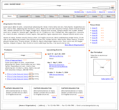
1. A website wireframe prepared for one of the sites you picked that is in the same "genre" of the site you'd like to make, their first and second level pages. A wireframe example (click to enlarge):
2. Make a website flowchart as well (you can do a google image search for "website wireframe" and "website flowchart" to see examples). A flowchart example (click to enlarge):

Be ready to talk about the sites you analyzed (via drawing up the wireframe and flowchart) with your fellow classmates next class. Write and print out a list: what were the elements you liked about the site? What are the elements you disliked about the site? What elements would you like to incorporate into your own site?
I usually use illustrator for doing up wireframes and flowcharts -- if you have any familiarity with Illustrator, it's a good tool for dealing with text, lines, and boxes. There's a tutorial here that has some good time on wireframing in Illustrator.
Photoshop would be fine too -- though if you're unfamiliar with both Photoshop and Illustrator, I'd recommend just drawing these out by hand. Just make sure the names for all the navigation and content are legible. It might help to use graph paper.
The wireframe is to give an idea of all the pieces of content you need on a particular page. There might be some layout information in it, but it's far more about content than design. And since most sites have homepages that function differently than their interior pages, it's necessary two have at least two wireframes (for first and second tier page functionality) to give an idea of what's going on.
A flowchart, on the other hand, doesn't give an idea of everything that's on a page, but rather gives an idea of how the site as a whole is organized -- how the menu breaks the site into various sections, that may or may not have subsections. You don't need to draw out every single page, but you do need to draw out each section or subsection of your site.
The reasoning behind this exercise is to get you to dig deeply into the site architecture of a site that is trying to solve the same sorts of problems you'll want to solve for your own website. It will hopefully give you some ideas on how to organize your own site (or how not to organize it, as the case may be).
http://www.456bereastreet.com/archive/200501/turning_a_list_into_a_navigation_bar/
After I've gone over this page, take the source code from the finished example, then paste it into a blank text edit file, and save it as an html page to your computer. Edit the css for the page, and make the following stylistic changes:
1. change the names of all the nav buttons, and make them all external links to actual websites.
2. change the font face in the nav bar.
3. change the color of the nav bar, including in the "hover" state.
4. change the dimensions of the padding on the nav bar.
Your assignment for Monday's class is to have:
1. A website wireframe prepared for one of the sites you picked that is in the same "genre" of the site you'd like to make, their first and second level pages. A wireframe example (click to enlarge):

2. Make a website flowchart as well (you can do a google image search for "website wireframe" and "website flowchart" to see examples). A flowchart example (click to enlarge):

Be ready to talk about the sites you analyzed (via drawing up the wireframe and flowchart) with your fellow classmates next class. Write and print out a list: what were the elements you liked about the site? What are the elements you disliked about the site? What elements would you like to incorporate into your own site?
I usually use illustrator for doing up wireframes and flowcharts -- if you have any familiarity with Illustrator, it's a good tool for dealing with text, lines, and boxes. There's a tutorial here that has some good time on wireframing in Illustrator.
Photoshop would be fine too -- though if you're unfamiliar with both Photoshop and Illustrator, I'd recommend just drawing these out by hand. Just make sure the names for all the navigation and content are legible. It might help to use graph paper.
The wireframe is to give an idea of all the pieces of content you need on a particular page. There might be some layout information in it, but it's far more about content than design. And since most sites have homepages that function differently than their interior pages, it's necessary two have at least two wireframes (for first and second tier page functionality) to give an idea of what's going on.
A flowchart, on the other hand, doesn't give an idea of everything that's on a page, but rather gives an idea of how the site as a whole is organized -- how the menu breaks the site into various sections, that may or may not have subsections. You don't need to draw out every single page, but you do need to draw out each section or subsection of your site.
The reasoning behind this exercise is to get you to dig deeply into the site architecture of a site that is trying to solve the same sorts of problems you'll want to solve for your own website. It will hopefully give you some ideas on how to organize your own site (or how not to organize it, as the case may be).
Tuesday, February 3, 2015
Monday, February 2, 2015
Subscribe to:
Comments (Atom)