Sunday, March 31, 2019

Website

Temporary IP for website: 45.32.217.246
Only the template is online, have not uploaded changes that i've made offline.

 5 Week Plan:


  1. Gather stats for graphs 
    1. Use R to begin visualization 
    2. Be able to match colors to websites 
    3. Finalize colors for site 
  2. Mockup design around graphs and finish with R visualization 
    1. Begin to add words but lets the graphs speak for themselves
    2. font choice ect.
  3. Make use of other media to add long to site 
    1. Download and edit youtube video to match site 
    2. Figure out how to autoplay as a background 
  4. Ensure the site is useable on all platforms 
    1. Create name and change ip to Name
    2. Ensure VPS is the right choice for project 
    3. Add in grahps and statistics
  5. Finalize design, get feedback and adjust site 
    1. Workshop other ideas to add onto the site
    2. finish all missing work
Problem Log:

4/1: Finished website, april fools, installed and began visualizing stats for the website. Need to use another method to fill shot charts better given the lack of attempts last year. Need to install and use R on desktop PC and finish before next week.

4/15: Began trying to embed a background video similar to the public lands/space themed website we saw in class. Need to use adobe premier to edit together a small video with similar colors and tones as the inspiration image. and use either option chris linked as options in the comments of this.

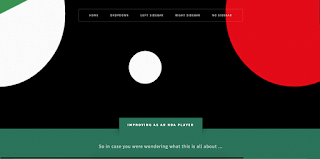
4/17: Test.mp4 is up and playing as a background video. This was done by creating a new div in the header and adding new lines of CSS to edit the background video. Problem I have now is the view is extremely zoomed in to the video cropping lots of the video out. Here is what it looks like now, the full video completely shows those two circles on either side.


5/1: This website is certainly difficult. Any small changes I make affect the whole website. I have made the video to play on the background and have small templates for the information in the main body of the website.

5/6: Video is still smaller than it should be. Have to remove or incorporate some of the elements on the  template. Need to link tabs across the top. Decide whether or not to write along side some of the images to tell a story.

Thursday, March 28, 2019

Website, 5 week plan, and problem log


5 Week Plan: 

Week 1: Finish the About page and start brainstorming ideas for a homepage video. Gather a shot list,   and come up with a plan of how you want it to flow. 

Week 2: Finish uploading all photos into the photography page and have them organized by type. Begin shooting video for the homepage video. Figure out times to use the sound room so that other people can help with equipment. Upload Videos into the video section and decide how you want to organize them. 

Week 3: Start putting in all your best writing into the website and divide by type of writing. Finish up any other filming that needs to be done for the homepage video and begin editing.

Week 4: Have a rough draft version of your website ready to go, including the homepage video which should be completed sometime within this week.

Week 5: finishing touches on the website, as well as "marketing" it to people, and working out any kinks with it, and making sure it is "live"

Problem Log:

4/8: Wix has a really cool blog feature that is somewhat customizable, but I am struggling to find good tools to lay out all of my writing for the portfolio. I am trying to customize their blog feature as much as possible, but I am starting to realize that Wix isn't as customizable as I was hoping. 

4/15: I have run out of the free video space provided by Wix, which means I will have to start looking at a paid plan. Their video customization is also very limited which is annoying. Having issues with my computer not running Wix very efficiently. My computer runs my website super slow and it seems that sometimes it won't save my changes. I've had to re-do changes multiple times.

4/17: I am trying to optimize my website for mobile, however, there are issues with my writing section of the website. For some reason, there is a search bar for videos in the writing section which is not there in the desktop version and my stories that fall under different categories, journalism, research, and creative only work in the desktop version and not the mobile. This is frustrating because the majority of people who are going to look at the site will most likely be viewing it on their phone, so I want this feature to run correctly.  

Wednesday, March 27, 2019

https://klimankyra.wixsite.com/mysite

Blog- posts about personal expeditions, articles, rock climbing, backpacking, snowboarding, touring (splitboarding), hikes

About- Personal experiences, lessons I have learned from multi-day expeditions, informative articles about travel and the outdoors


Link to Website

https://elizabethwhite490.wixsite.com/mysite

Blog - Posts about my own travel experiences, my own writing about different gear, trips, inspiring women who travel, and further down the road some submissions from other women who travel and adventure whose stories can inspire other women to do the same

About - About me and how I became interested in this topic, what I do

Contact - For inquiries and post submissions

Homework for Monday (4/1)

Before Monday's class (4/1) you should have your homepage images and text posted. You will also need to make a blog post here on the class blog, and in that post I want you to include:

1. A link to your in-process site (if it is online - this doesn't apply if you're working off a downloaded template. If you are working off a downloaded template, please take a screenshot of your homepage and include it in your post).

2. A "five week plan" that will lay out what you intend to do in the remaining classes for the semester.

3. The start of a "problem log."

Let me explain the last two items:


THE FIVE-WEEK PLAN

Starting today, I want you to make a post on this blog laying out a five-week plan for yourself – explaining what you plan to accomplish in class for this week and the following five weeks. The plan is for you to have at least a rough draft of your completed site up by the end of tweek four. That will give us a couple weeks to do some social media marketing around your site, and to make final touches/edits on your site.

A plan for a portfolio site might look something like this:

Week 1:

Wednesday: Write "About Me" section, get a good "action photo" of myself using the camera. Send emails to clients I've had, to try and get "testimonials" I can use on my site.

Week 2:

Monday: Organize all my photos, sort them into categories (Nature, Wedding, Personal Work), and select the strongest 12 images for each gallery. Resize them for the web and upload them.

Wednesday: Design a logo for the header of the site, and create the header in Photoshop.

Week 3:

Monday: Start a "blog" section for the site, documenting the last photo shoot I was on.

Wednesday: Make another blog post; incorporate a map into my site, so I can tag locations of my travel photography.

(etc.)

Notes: 

A. if you're making a blog site, just give yourself a week or two to set up the design and make a couple posts – for the remaining weeks, you should use the class time to make two blog posts a week.

B. Please let me know 

C. Week 4 should have listed "have a full rough draft of the website" – and week 5 should include time for marketing the site through social media.


THE PROBLEM LOG (which is built out from the same "five week plan" blog post on this site)

You'll add to that initial five-week plan blog post, writing an ongoing "problem log," detailing the sorts of things you figure out along the way. For example, maybe you figured out how to get into the CSS of his wordpress site, and adjust stylings in the header. Or maybe you started to use a bootstrap template, but then abandoned it for another, because the first one seemed to be too easy to "break" when you customized it. 

You'll add to your "problem log" as you work on your site, taking ten minutes or so each class, developing a list of all the obstacles you overcame, and how you overcame them (with links to helpful references and tutorials sprinkled through them). Just pull up the original blog post you made for your three-week plan, click on the little pencil icon at the bottom of it, and that will allow you to edit the post – in edit view, you can add to your problem log each class. Date each entry. It will work as a sort of database for the class - and for yourselves, so you don't have to re-fix any problems you fixed once. Give the post the "tag" "log" se we can sort through all of them easily.


Monday, March 25, 2019

For Wednesday, 3/27

For Wdnesay's class, I want you to do the following:

1. Have a draft of a homepage posted for the site you're making, on whatever host/template you've chosen.

2. Work out wireframes and a flowchart, which you'll turn in on Wednesday.

Decide what "genre" of site you're making, and find three examples of well-designed websites that already exist in that genre. So, if you're making a design portfolio site, find three portfolio sites for designers. And then:

AWrite and print out a list: what were the elements you liked about the sites you picked? What are the elements you disliked about the sites? What elements would you like to incorporate into your own site? The could be use of palette, organization, navigation, use of images, use of fonts, etc.

B. Create a wireframe for the homepage of JUST ONE of the sites you picked, as well as a wireframe for one of the "second level" pages (that is, one of the pages you get to by clicking on the nav bar), and a flowchart for the site (refer to the the images below for visual references).

I usually use illustrator for doing up wireframes and flowcharts -- if you have any familiarity with Illustrator, it's a good tool for dealing with text, lines, and boxes.

Photoshop would be fine too -- though if you're unfamiliar with both Photoshop and Illustrator, I'd recommend just drawing these out by hand. Pencil or ballpoint pen on unlined paper would be great (and if you need to, you can steal some unlined paper from the copier on the second floor). Just make sure the names for all the navigation and content are legible.

The wireframe is to give an idea of all the pieces of content you need on a particular page. There might be some layout information in it, but it's far more about content than design. The rationale for asking for two wireframes stems from most sites having homepages that function differently than their "interior" pages, so it's necessary to have at least two wireframes (for first and second tier page functionality) to give an idea of what's going on.

A flowchart, on the other hand, doesn't give an idea of everything that's on a page, but rather gives an idea of how the site as a whole is organized -- how the menu breaks the site into various sections, that may or may not have subsections. You don't need to draw out every single page, but you do need to draw out each section or subsection of your site.

The reasoning behind this exercise is to get you to dig deeply into the site architecture of a site that is trying to solve the same sorts of problems you'll want to solve for your own website. It will hopefully give you some ideas on how to organize your own site (or how not to organize it, as the case may be).

Here is a wireframe example (click to enlarge):


Here is a website flowchart example (you can do a google image search for "website wireframe" and "website flowchart" to see more examples).

 Click to enlarge:


At the end of the day, the wireframe and flowchart are just boxes – or buckets for the content to be thrown in. You'll eventually make a wireframe and flowchart for your own site, and that will give you a solid guide to know what content you need to assemble and produce to make the site feel "filled out."


Wednesday, March 13, 2019

Links for Wednesday (4/13)

Your task, over Spring Break, is this:

1. Do some research, and poke around some web hosting or web template options for the site that you will be creating once we get back from Spring Break. Every hosting option, and every template, will have its own pros and cons. And different students will have different needs – maybe one of you will need an e-commerce solution, and maybe another one of you will want a looping video background for your homepage. Not every platform will have those options – you have to find the one that has the best collection of options you desire. You can google comparisons of platforms (for instance, looking at the results for a "blogging platform comparisons" search), though I've found it takes a little poking-around within the various options to really get a sense of what themes, options, and limitations each platform has.

Most of the hosting options have a "free" version  that usually has the company's branding in your URL (for instance, having your website URL be "byname.wix.com." If you're just making a website for the experience in this class, feel free to use one of these free, branded options (though I always prefer students create a site they will actually use after the class is done, just because ). But if you want your site to seem "professional," you'll need to shell out a little money for non-branded hosting and domain names (usually about $5/month).

2. By our return on Monday (4/25), I want you to have selected a hosting platform or template. And I want, typed and printed out, an explanation (of no more than three paragraphs) explaining why you chose the platform/template you selected. What were the features that seemed appealing? Were there any limitations to other platforms that steered you away from them?

Some hosting options for your website:

Weebly
Wix
Wordpress

Shopify (integrated eCommerce)

Some comparisons:

For those of you who weren't in the is Wednesday's class, actually sign up for a couple of these options, and being playing around with the webpage editor attached to them.

Hosting options, if you're creating a site from a template:
GoDaddy
Pair Networks

Templates:
http://www.free-css.com/free-css-templates
https://templated.co

And looking at ongoing FaceBook controversies:

Elizabeth's Warren's Anti-Trust Proposal:

https://medium.com/@teamwarren/heres-how-we-can-break-up-big-tech-9ad9e0da324c

Warren's anti-FaceBook ad taken down, temporarily, by FaceBook:

https://gizmodo.com/elizabeth-warrens-ad-saying-facebook-has-too-much-power-1833216732

Monday, March 11, 2019

Midterm Links

Here is a link to download the questions for our midterm:

https://www.dropbox.com/s/voctzvbwjoib7m9/midterm-questions.rtf?dl=0

And here is a zipped file of the reference files you need to answer the questions:

https://www.dropbox.com/s/kpo58j4a7zlclyp/HTML-AND-CSS-REFERENCE-FILES.zip?dl=0

You will be posting your zipped file here:

https://drive.google.com/drive/folders/0BwMLOeZY_KN0ZzJMZmtBVXhCYXc?usp=sharing

Monday, March 4, 2019

Homework for Wednesday (3/4)

Before Wednesday, in  pursuit of our ongoing look at how Facebook has become used as a platform for disinformation, I want you to look at one of the third-party fact check organizations FB has used to evaluate news stories. Go to one of the sites below, and look up one story on a topic that is of interest to you. Next class, I want you to have a link to that story – and please write out (and print out) a one-to-two paragraph summary on what you found persuasive (or unpersuasive) about the fact-checking site's argument.

https://www.snopes.com

https://www.factcheck.org

https://www.politifact.com

Post your personalized parallax template here

On the google drive:

https://drive.google.com/drive/folders/0BwMLOeZY_KN0ZzJMZmtBVXhCYXc?usp=sharing

Parralax and other references

SOME REFERENCES TODAY

Today we'll have you start to unpack a parallax template. These are the things I want you to modify:

1. Top three images
2. Header font (use a different google api font, and change the color)
3. Text for the first few paragraphs (you can copy and paste from other sources)
4. Swap out different icons, and change their color

Here are some sources:

Original template download page:

https://html5up.net/photon

Modified template download page (this is the one to use for class):

https://www.dropbox.com/s/dlrmc2q3hcbcz9p/photon-template-color-coded.zip?dl=0

Font awesome reference:

https://www.w3schools.com/icons/fontawesome_icons_intro.asp

Complete list of font awesome icons:

http://astronautweb.co/snippet/font-awesome/

Here's a link to a parallax template, with a few tweaks, and some color-coding:

https://www.dropbox.com/s/2v82ch3qr125cis/photon-template-color-coded.zip?dl=0

And here are some resources we'll talk about –

FONT RESOURCES

Embedding fonts through Google developer:


Listing of available fonts:


Where to find it in the template: main.css

@import url("https://fonts.googleapis.com/css?family=Source+Sans+Pro:300,300italic,400,400italic");

body, input, select, textarea {
color: #666;
font-family: "Source Sans Pro", Helvetica, sans-serif;
font-size: 16pt;
font-weight: 300;

line-height: 1.65em;
}


SPLITTING BODY AND HEADER TEXT:

splitting h1 and body text

h1, h2, input, select, textarea {
color: #666;
font-family: "Lobster", Helvetica, sans-serif;
font-size: 16pt;
font-weight: 300;
line-height: 1.65em;
}

body, input, select, textarea {
color: #666;
font-family: Helvetica, sans-serif;
font-size: 16pt;
font-weight: 300;

line-height: 1.65em;
}

CHANGING THE COLOR OF THE FIRST HEADER TEXT:


COLOR OF HEADER TEXT

set it to blue

#header h1, #header h2, #header h3, #header h4, #header h5, #header h6, #header strong, #header b {
color: yellow;
}

CHANGING THE COLOR OF THE HEADER IMAGE AS IT LOADS:

Look for "gradient"

header

#header:after {
-moz-transition: opacity 1s ease;
-webkit-transition: opacity 1s ease;
-ms-transition: opacity 1s ease;
transition: opacity 1s ease;
background-image: linear-gradient(45deg, #f20444, #4361c2);
content: '';
height: 100%;
left: 0;
opacity: 0;
position: absolute;
top: 0;
width: 100%;
}


footer

#footer {
padding: 6em 0 6em 0 ;
background-color: #d12e49;
color: rgba(255, 255, 255, 0.75);
background-attachment: fixed, fixed, fixed;
background-image: url("images/overlay2.png"), url("images/overlay4.svg"), linear-gradient(45deg, #4361c2, #4fa49a 50%, #9dc66b 95%);
background-position: top left, center center, center center;
background-size: auto, cover, cover;
text-align: center;
}


And some reference links on online misinformation:

https://www.nytimes.com/video/opinion/100000006188102/what-is-pizzagate.html

Websites of fact-checking organizations that Facebook has used to evaluate news sources:

https://www.snopes.com

https://www.factcheck.org

https://www.politifact.com